
Creating Basic Charts
Excel's charting tools may be just what you need. Charts depict data visually, so you can quickly spot overall trends. They're a fabulous way to help you find the meaning hidden in large amounts of data. You can create many different types of charts in Excel, including pie charts that present polling results, line charts that plot rising or declining assets over time, and three-dimensional area charts that show relationships between environmental conditions in a scientific experiment.
Excel's charting tools are enormously flexible: You can generate a simple chart with standard options in a couple of mouse clicks, or you can painstakingly customize every aspect of your chart's appearance (including colors, scale, titles, and even 3-D perspective).
All charts are not created equal. Depending on the chart type you use, the scale you choose, and the data you include, your chart may suggest different conclusions.
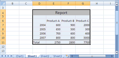
- Select the data (sequential or nonsequential) you want to plot in the chart. For an example of sequential data selected
for a chart.
- Press the F11 key. Excel immediately adds a new sheet called Chart1 to your workbook with the data plotted into a column
chart. Each subsequent chart page is numbered sequentially such as Chart2, Chart3, and so forth. See the various elements
that can make up a chart.
Some newer keyboards use a different function for the F11 key. If your F11 key does not produce a chart, use the Insert tab as explained in the next section. In this tutorial you will learn how to edit the look and style of a chart.
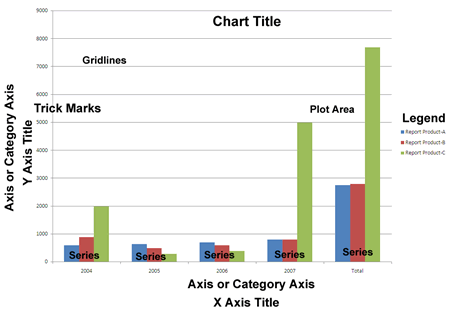
Title:
A descriptive name for the overall chart. By default, titles are not added in a basic chart, but you can add them later manually or by using the Chart Wizard.
X or Category axis:
Column or row headings from your selected data, which Excel uses for Category axis names. In a column chart, the categories display along the bottom. In other charts (such as a bar chart), the category axis displays along the left side.
X Axis Title:
A descriptive name for the Category axis. By default, a category label is not added in a basic chart, but you can add one later manually or with the Chart Wizard.
Y or Value axis:
A scale representing the zero or the lowest and highest numbers in the plotted data. The Value axis is usually located on the left side on a column chart or on the bottom on a bar chart.
Y Axis Title:
A descriptive name for the values. By default, a value label is not added in a basic chart, but you can add one later manually or by using the Chart Wizard.
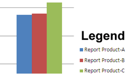
Legend:
The box, usually located on the right, identifies the patterns or colors that are assigned to the chart data series. Legend explains that one shade of color represents Product-A, another shade is for Product-B, and the third color shade is for Product-C.
Tick marks:
The small extensions of lines that appear outside of the gray area and represent divisions of the value or category axis.
Gridlines:
These lines extend from the tick marks across the chart area to allow you to easily view and evaluate data.
Series:
Excel uses the worksheet cell values to generate the series. Each element, called a data marker, represents a single worksheet cell value. Related data markers make up a data series and have the same pattern or color. See the comparison of the data values to the y-axis and the series values.
Plot area:
The background that represents the entire plotted chart area.
To delete this chart, right-click the Chart tab and select Delete. When Excel asks for a confirmation, click Delete again.
Activating a Chart
Before you can do anything with a chart, you must activate it, as follows:
- To activate a chart on a chart sheet, click the chart sheet's tab.
- To activate a chart that you embed in a worksheet, click the chart border area.
After you activate an embedded chart or a chart on a chart sheet, Excel displays the Chart Tools contextual tabs on the Ribbon. Double-clicking the chart automatically displays the Design tab tools on the Ribbon.
In this tutorial:
- Creating Charts in Excel 2007
- What is a Chart?
- Creating Basic Charts
- Formatting a Chart Element
- Insert Chart
- Chart Styles
- Adjust the Chart Location
- Display a Chart Title
- Displaying a Data Table in a Chart
- Change Axis Options
- Enhance a 3-D Chart
- Adjust Chart Data
- Creating and Using a Chart Template
- Working with Excel Charts
- Excel Charts Tips