
Chart Styles
Chart styles give you a way to apply shake-and-bake formatting to ordinary charts. Excel includes a wide range of chart styles that vary from simple, flat charts with minor accents (like colored borders) to showier styles that include bevel effects and shadows. You can quickly create plain or opulent charts, depending on your needs.
Before you use a chart style, it's important to understand what it changes (and what it doesn't). Every chart style includes settings that determine:
- The background color.
- The colors for each series (which may be displayed as bars, lines, points, or something else). Some colorful chart styles use all the colors from the current theme. Other chart styles take a single color from the current theme and use multiple shades of that color for a more refined look.
- Shape effects, like softly curved or beveled edges, shadows, and glow.
- Marker styles (for line and XY scatter charts) that distinguish the points in one series from those in another.
On the other hand, chart styles don't change the font Excel uses for the chart title and labels; instead Excel bases these elements on the current theme. Chart styles also don't change the layout of the chart or the chart settings Excel uses for the legend, scale, axis titles, error bars, and so on.
Change the Chart Type
- Click the chart to select it, whether it appears on its own sheet or on a data worksheet. A Chart Tools tab with three
subtabs appears.
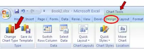
- Choose Chart Tools Design> Type> Change Chart Type. The Change Chart type dialog box appears.
- Select the different chart type and subtype you want.
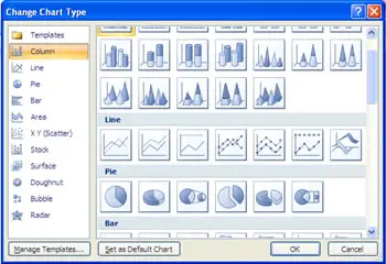
- Click OK. Excel modifies the existing chart.
In this tutorial:
- Creating Charts in Excel 2007
- What is a Chart?
- Creating Basic Charts
- Formatting a Chart Element
- Insert Chart
- Chart Styles
- Adjust the Chart Location
- Display a Chart Title
- Displaying a Data Table in a Chart
- Change Axis Options
- Enhance a 3-D Chart
- Adjust Chart Data
- Creating and Using a Chart Template
- Working with Excel Charts
- Excel Charts Tips